Going Mobile3 min read
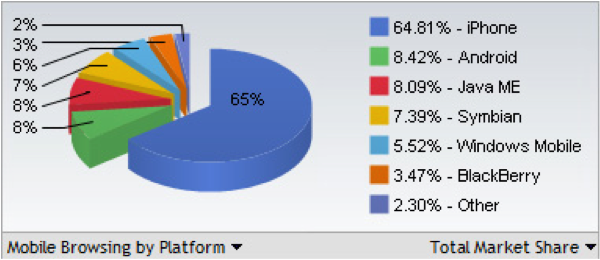
November 15, 2010The widespread adoption of the iPhone is catapulting mobile web usage into the mainstream. According to Morgan Stanley, the adoption of the iPhone and iPod Touch is out-pacing even the early adoption rate of the desktop Internet itself. In fact, over 46 Million people in the US actively browse the mobile web each month. Surprisingly, it’s not just the early adopters that are using these devices. Morgan Stanley notes that the iPhone has had the fastest hardware user growth in the entire history of consumer electronics. It has not only grown faster than the enormously popular Nintendo Wii, it has blown right past even the ubiquitous iPod. And that’s just the iPhone…
Clearly mobile device usage is on the rise, and it’s no longer something smart marketers can ignore. Just because a device uses a small screen does not mean you should have a small online mobile presence. And while browser usage is currently being dominated by the iPhone, the fact remains that a variety of devices access mobile websites. Sometimes you navigate with your finger, other times you move a pointer with keys. It all depends on the device, and each of these devices also has a different resolution, different screen size and a different orientation, adding additional layers of complexity. Fortunately, the dominate operating systems (Apple iPhone OS, Google Android and others) currently all run Webkit, a standards-based browser that renders code very well.

A mobile version of your website can be created as an add-on to any existing website, or as part of the development of a new website. There are a few ways your website can be made to detect mobile devices, their capabilities and screen sizes. Tools like deviceatlas.com and detectmobilebrowsers.mobi work well, but rarely perfectly. Testing a website in a variety of devices is the only surefire way to make sure it looks good in all browsers. A large number of mobile website developers use WebKit, which supports a majority of the HTML 5 specifications for future browser compatibility.
If you do not yet have a website, focusing your efforts on the core site first is always recommended. Once a core site is in place, you can typically:
• Re-use static content from your website, so nothing else is needed.
• Have an extra style sheet created for mobile devices to read, removing animation, re-ordering text, re-aligning images, etc. to allow content to work better on these devices.
In terms of functionality, the possibilities of off-line data storage, drag and drop interfaces, easy video embedding and geo-location are almost endless. Many modern mobile devices have GPS chips in them, and the browsers are location aware. So one day, you could be in a restaurant and surfing their site. The restaurant’s website asks to see your locations via GPS, and it knows you are in the store. It then displays a message recommending that you get “today’s special now,” and offers a 10% coupon.
Much like a traditional website, the possibilities for mobile website applications are virtually limitless. But by creating a mobile version of your site, you’ll ensure mobile device users have a good experience with your brand regardless of what they might be using to find you.