Sharp Innovations Blog
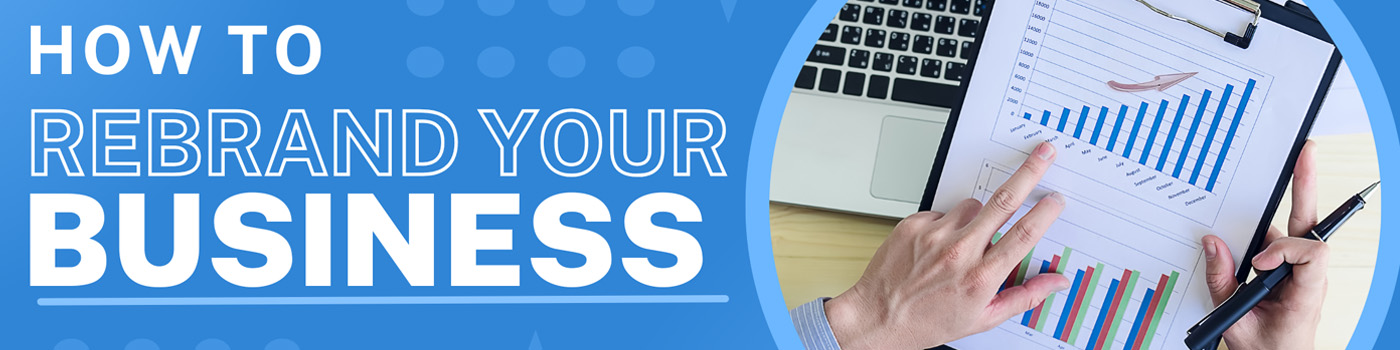
How to Rebrand Your Business
July 1, 2025Rebranding is more than just updating a logo or picking new colors. It’s a strategic move that reshapes how your business is perceived by your audience. When done with care and purpose, the choice to rebrand your business can breathe new energy into your marketing, better reflect your values, and help you stay competitive in an ever-changing market.

AI Photography: Revolution or Risk for Professional Photographers?
June 15, 2025The landscape of visual arts is transforming rapidly with the rise of AI-generated photography and image enhancement tools. Whether you’re a seasoned professional or a new photographer, these evolving technologies bring both exciting opportunities and unique challenges. For many in the photography industry, one fact remains clear: the human creative vision is irreplaceable.
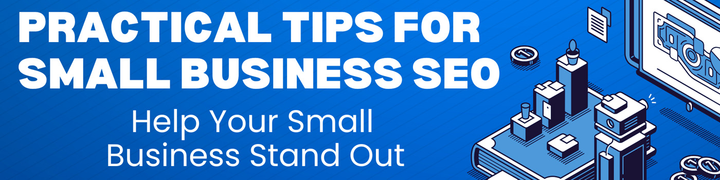
Practical Tips for Small Business SEO – Help Your Small Business Stand Out
June 1, 2025SEO – WHAT YOU NEED TO KNOW
Key Takeaways:
- Small Business SEO is essential for driving organic traffic at a low cost.
- Local SEO and keyword optimization are particularly effective for small, local businesses.
- Avoid common mistakes like neglecting content updates or keyword stuffing.
- Track performance through tools like Google Analytics and adjust your strategy based on data insights.
Search Engine Optimization (SEO) is the backbone of online visibility. For small businesses, this means competing for users’ attention on a crowded search engine results page (SERP). Unlike paid advertising, SEO delivers organic traffic without recurring costs, making it a budget-friendly marketing solution.

How to Sell on Amazon (Part II)
May 15, 2025(How to Sell on Amazon Part I) Now that you’ve set up your Amazon seller account and understand the basics of listing and fulfillment, it’s time to explore how to stand out.
Let’s cover paid strategies, like ads, and ways to drive traffic to your products. You’ll also need to learn how to earn customer reviews that build credibility and drive more sales.
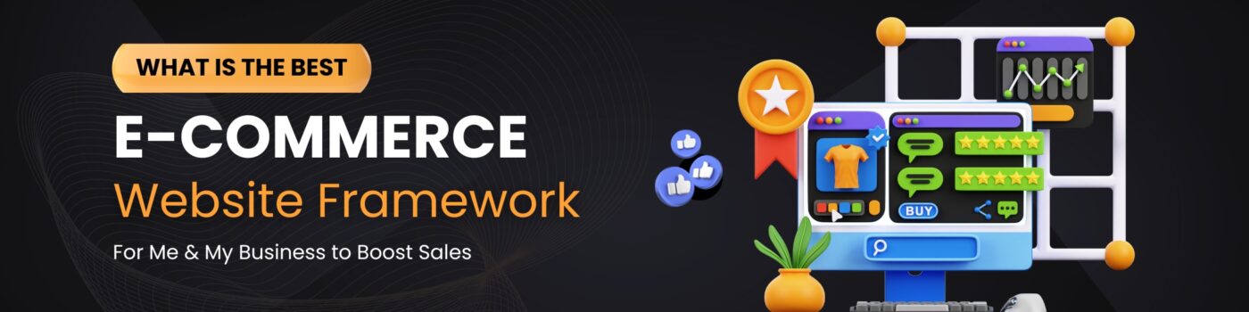
What is the Best e-Commerce Website Framework?
May 1, 2025One of the most important decisions to make in the early stages of planning a new e-Commerce website, or re-designing your existing e-Commerce website, is choosing the right platform to build it on. There are many factors to consider, and it is important to understand that a one-size-fits-all solution does not exist.
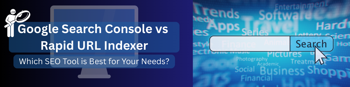
Google Search Console vs Rapid URL Indexer: Which SEO Tool is Best for Your Needs?
April 15, 2025If you’re looking to improve your business’ organic traffic rankings, understanding the differences of Google Search Console vs Rapid URL Indexer is the best place to start. It’s essential to consider the benefits and drawbacks of each tool, as they serve distinct functions to help businesses enhance their online presence. In this blog, we’ll explore the key differences, advantages, and use cases for both tools, making it easier for you to determine which one best suits your needs.
Higher Purpose in Action: Transforming Lives With The Factory Ministries
March 15, 2025Since our founding in 1999, Sharp Innovations has been guided by more than just a passion for creative and strategic solutions. We’ve had a calling—one rooted in purpose, faith, and community. That calling drives our Higher Purpose Program, a mission to support underprivileged youth, single parents, and widows both locally and globally by leveraging our time, resources, and talents.
Over the years, we’ve watched with awe and gratitude as this program has grown, fueled by a desire to honor God by uplifting those in need. From our community home in Lancaster County and ever outward to our expanding network of partner programs worldwide, our Higher Purpose is carrying out a simple but profound vision: to make a lasting difference in the lives of those often overlooked.
Ad Audience Targeting: Capturing Relevant Users for a Higher ROI
March 1, 2025Whether it’s on Google Ads, Facebook, or another platform, building the right audience is a key component in advertising. If you’re targeting the wrong individuals, even the most eye-catching ads won’t drive sales. But with the right ad audience targeting— and a team that’s got your back— you’re bound to see a higher ROI.

How to Sell on Amazon
February 15, 2025Selling on Amazon is a great way to reach millions of customers worldwide. To get started, create a seller account, choose between an Individual or Professional plan, and list your products with high-quality images and descriptions.
Once you’ve set up your Amazon seller account, success comes down to how well you manage your listings, fulfillment, and customer experience. Here are key factors to help you maximize sales, build trust, and grow your business on Amazon.

Get More Leads with Google Business Profile: Tips for Your Local Service Business
February 1, 2025Google Business Profile, formerly Google My Business, is a free-to-use business listing platform. It (GBP aka GMB) allows businesses to create a profile that appears in Google Search and Google Maps.
Is it worth it to set up a Google Business Profile? Yes, setting up a Google Business Profile is absolutely worth it for a local service business.