Sharp Innovations Blog

Archives: 2011 October

888.575.8977


T:717.290.6760
F:717.290.6877


117 SW End Ave
2nd floor
Lancaster, PA 17603

2011: Design Less Restricted

While the Internet itself is still relatively young, it changes a little bit every year. In 2010, design for mobile devices boomed, typography emphasis flourished and many other aspects of web design took leaps forward as well. But now that 2011 has come and 2012 is nearly upon us, what’s coming next?

The Death of Flash

Adobe Flash was once a widely used tool thanks in no small part to its easily implemented interactivity, but its best days may be behind it. HTML5 and CSS3 are quickly becoming its replacement. For those not affiliated with Adobe, this is largely an exciting and welcome change because it will allow for more cleanly produced designs and the reduction of load times.

There are many reasons for the move from Flash. One factor is the implementation of CSS3 transitions and animations. These make it easier to create moving backgrounds, growing buttons, fading objects, and many other flourishes. Additionally, many JavaScript libraries are also growing in use, and allow for a more rich and interactive user experience. A prime example is that of jQuery. The jQuery slogan of “Write less, do more” is particularly apt, since it allows designers to more easily add interactivity, user feedback, etc. while the technical writing is simple and clean. One current trend in web design that takes advantage of this language is the single page website. These sites dynamically move content as a method of producing a clean and centralized design. Since that jQuery it is not a proprietary language, it will cleanly integrate with the other elements of the website—something that can’t be said of Flash.

Aside from competing technologies, the decline of Flash can also be attributed to the growth of the mobile market, in which Flash is weakly supported, if it is supported at all.

Typography is Beautiful

Good designers love typefaces, and the more ability designers have to manipulate their usage, the better. For many years, web design was stuck in a place where only a few fonts were known to be cross-platform, which restricted their usage. No more. Web design is now at a place where it has a plethora of options available, so the desired font can be used while still adhering to web standards! A few new technologies have made this possible.

Cufón is one, well-used method to ensure font stability by converting text into a vector (or line-based vs. pixel-based) format. One of our favorites is the @font-face method, in which actual fonts are downloaded with the website, giving complete access to every character and element. The concerns here are that downloading multiple fonts and weights can become pretty heavy, and different browsers require different file types to be read correctly. To address this, tools like Typekit and Google Fonts API allow for the adding of custom fonts, while not having access to the font files yourself. This works by choosing the desired fonts, then adding a line of code to pull that information from the respective source. All in all, this meets the requirement for cross-platform compatibility, and allows the artist to dedicate more time to creative endeavors instead of fiddling with technical limitations.

Adding Color and Textures

Another 2012 trend is the move toward more simple color schemes and textures. Let’s start with color. Forget about color and shades like black, white and grey. Instead, go for something really engaging. More and more web sites are experimenting with primary colors such as green, yellow or red, but it is best to limit palettes to two or three colors. Web designers can play with different shades of each color and create inspiring combinations to help communicate a feel or reinforce an identity.

In addition to a simplified color palette, textures are now being used to add depth and interest. Textures do not necessarily have to be bold. In fact, sometimes subtle is better. Textures can create additional layers of interest while allowing viewers to focus on the areas of most importance. Many viewers will never consciously notice that the background of your site has been made to look like weathered paper, or that there is “noise” (little flakes of color or black and white), or that the borders look like wood. But that’s really the point. Textures are about creating effects that add depth and dimension without being overpowering.

Mobile is Hot

Whether we like it or not, mobile devices are everywhere. This fast growing market adds a lot of excitement to dynamic web design, but also presents new challenges.

One concern in mobile design is the vast difference in screen sizes, and making content fit well on all sizes and resolutions. One answer to this problem is that of a gridded format, which can be resized and reordered to fit any screen size. Grid layouts are becoming more common, and allow for a very well structured site with clear organization and hierarchy. Another challenge derived from mobile devices is that of the touch interface. The mouse is non-existent, meaning all interactivity must be accessible through tap, or sometimes just the swipe of a finger.

The Future

It’s inevitable that more changes related to web design are on the horizon, and likely always will be. But regardless of what changes, designers can’t forget the importance of usability and creating meaning from the design. Good design will add value through its ideas. It’s up to the talented and resourceful designer to determine what technologies can help bring these ideas to reality.

Posted by: Chris Divyak on October 21, 2011 @ 4:51 pm
Filed under: Mobile Web DesignWebsite Design

The Importance of A/B Testing

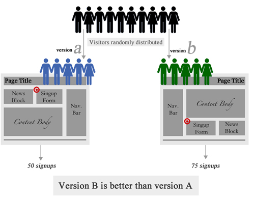
So you have a great website, traffic is good and you are receiving inquires. But what about all of the visitors who come to your website and leave without contacting you? Have you ever wondered why visitors aren’t clicking on your calls-to-action or picking up the phone to contact you?

It’s tempting to think having a website with all of your information displayed will be enough to entice the user to fill out a form or pick up the phone, but this isn’t always the case. So how are you tracking whether or not there are certain elements of your website that can be improved? There are new methods of A/B testing that can make this tracking easy.

What is A/B Testing?

For our purposes, A/B testing is a way to track how people are getting through your website and what improvements need to be made. It allows businesses to test a different design and format of a webpage to see whether or not it is more effective than the current page. The testing should be random to ensure that a wide range of users get either page “A” or page “B.”

Google Analytics and Google Optimizer

To conduct some simple A/B testing, Google Optimizer and Google Analytics is a great place to start. Both of these tools are free to any user and offer a lot of insight into possible bottlenecks and problems that users are having with your website. Google Analytics allows you to measure click-through rates to other pages of your website once a user gets to the homepage. Google Analytics also allows you track how many interior pages users are seeing and also seeing the average amount of time someone spends on the page or whether they click to the page and exit. If the rate of exit is high on one page, that is a good indicator that there are some improvements that can be made. By narrowing down the problem pages in your website, you can start to think about improvements in usability and performance.

Businesses often re-work their websites to gain better user experience and higher conversion rates, but how can they actually measure the effectiveness of new layouts and designs? Google Optimizer allows you to do that. You can keep the original page you were using and also create a new page to see which one performs better. By putting a small script in the <head> tag of your website, Google Optimizer will randomly give the visitor either page “A” or page “B.” It will then track the clicks, conversions and bounce rates of those pages and show you which pages are performing better from a user’s standpoint. This can be very helpful to improve conversions and see what further improvements can be made.

The Importance of A/B Testing for Business

Businesses are always trying to improve the number of products or services they sell. And with so many businesses relying on their website to generate leads, it’s vitally important to do A/B testing. A website often creates the first impressions a new visitor receives a business. If the look and usability of the website is poor, visitors may be apprehensive about taking action.

Without A/B testing, your website may not be living up to its full potential and may be hurting your bottom line. This is especially true if you are running an e-commerce website where online sales are critical. If a user is frustrated or cannot find the information they are looking for within a short amount of time, they will leave your page and possibly never return. That is why it is crucial for your business to track bounce rates and the average amount of time a visitor spends on a page. If a visitor only spends an average of one second, and that page has a bounce rate of 80%, it is a good idea to look at the layout and elements on the page to see how you can simplify the user experience without losing the quality of content.

Heat Maps and User Behavior

If there is one website that has taken heat map technology and refined their entire flow of content because of it, it’s Google. With most people reading from left to right, it makes sense that visitors will almost always scan your website in the same fashion. The average amount of time a visitor spends on a webpage is about three seconds. If you can’t gain the visitor’s attention within three seconds, they may leave. A great tool to help gauge where people are clicking (and what people are most interested in on your website) is a freeware program called “Clickheat.”

Clickheat generates a heat map of any webpage on your website to show you where visitors are clicking the most. This can be a good indicator of where to put important calls-to-action or news on your website. More information about Clickheat can be found at http://www.labsmedia.com/clickheat/index.html.

More Resources for A/B Testing

  • ABtests.com
    A place to share and read A/B test results.
Posted by: Chris Divyak on @ 4:49 pm
Filed under: Internet Marketing