

As we approach 2026, businesses face a critical web development question: How do you build a website that won’t just survive the next wave of technological change, but thrive in it? Things are changing quickly when it comes to web design and development; and what worked for your website last year might already be outdated. What works today, may not cut it tomorrow.
The answer lies in future-proof web development, achieved with a strategic approach that combines current best practices with the flexibility to adapt to emerging technologies. Whether you’re planning a complete website overhaul or looking to optimize your existing digital presence, understanding these principles will save you time, money, and countless headaches down the road.
Why Future-Proofing Matters More Than Ever
Consider this: the average website redesign costs between $15,000 and $100,000, depending on complexity. Yet many businesses find themselves needing another overhaul within just 2-3 years because their site can’t keep pace with new devices, user expectations, or search engine requirements.
Future-proof web development isn’t about predicting the future with perfect accuracy. It’s about building websites with the architectural flexibility to adapt, scale, and integrate new capabilities without requiring a complete rebuild. It’s the difference between a website that ages gracefully and one that becomes a digital liability.
The Foundation: Mobile-First Design in a Multi-Device World
If you’re still thinking “mobile-friendly,” you’re already behind. The mobile-first web development approach has evolved from a trend to an absolute necessity. With mobile devices accounting for over 60% of web traffic globally, Google’s mobile-first indexing means your mobile experience is now the primary factor in search rankings.

What Mobile-First Really Means
Mobile-first doesn’t just mean your site looks good on smartphones. It means designing the core experience for mobile screens first, then progressively enhancing for larger displays. This approach forces you to prioritize what truly matters while eliminating bloat and focusing on essential functionality.
Practical Implementation:
- Start with a base design for 320px width (the smallest common viewport)
- Use responsive breakpoints at logical content breaks, not arbitrary device sizes
- Implement touch-friendly interface elements (minimum 44x44px tap targets)
- Optimize images with next-gen formats like WebP and AVIF
- Leverage lazy loading for images and videos below the fold
- Keep mobile page weight under 1MB for optimal loading on cellular networks
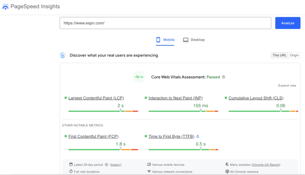
The performance benefits extend beyond user experience. Core Web Vitals (Google’s page experience metrics) heavily favor mobile-optimized sites. Largest Contentful Paint (LCP), First Input Delay (FID), and Cumulative Layout Shift (CLS) should all meet the “good” threshold, especially on mobile devices.

Pro Tip: Test your site on real devices, not just browser emulators. Network throttling in Chrome DevTools is useful, but nothing replaces testing on an actual mid-range Android phone over a 3G connection, which is still reality for many users worldwide.
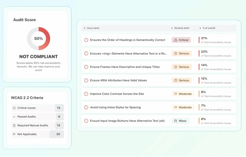
Accessibility: The Non-Negotiable Standard
Web accessibility has shifted from “nice to have” to legally required in many jurisdictions. Beyond compliance, accessible websites reach wider audiences, rank better in search engines, and provide better experiences for everyone.
WCAG 2.1 Guidelines: Your Accessibility Roadmap
The Web Content Accessibility Guidelines (WCAG) 2.1 Level AA compliance is now the industry standard, with many organizations targeting the even more rigorous AAA level for critical content. These guidelines ensure your website is usable by people with diverse abilities, including those using screen readers, keyboard-only navigation, or other assistive technologies.

Essential Accessibility Best Practices:
Semantic HTML Structure: Use proper HTML5 elements (<header>, <nav>, <main>, <article>, <aside>, <footer>) to create meaningful page structure. Screen readers rely on these elements to help users navigate efficiently.
Color Contrast: Maintain a minimum contrast ratio of 4.5:1 for normal text and 3:1 for large text. Use tools like the WebAIM Contrast Checker to validate your color palette during design.
Keyboard Navigation: Every interactive element must be operable via keyboard. Users should be able to tab through your site logically, with visible focus indicators showing their current position.
Alt Text for Images: Every image needs descriptive alternative text. Decorative images should use empty alt attributes (alt=””) to signal they should be skipped by screen readers.
Form Labels and Error Messages: All form inputs need associated labels, and error messages must be specific, helpful, and programmatically associated with the relevant field.
Video Captions and Transcripts: All video content requires synchronized captions. Providing transcripts benefits not just deaf users, but anyone in a sound-sensitive environment or with audio processing differences.
The business case for accessibility is compelling. An accessible website reaches the estimated 16% of the global population with disabilities; a market representing trillions in spending power. Moreover, accessible sites tend to be cleaner, faster, and more SEO-friendly because they follow semantic best practices.
Learn more about our accessibility audit services
Modular Design Systems: Building Blocks for Scalability
Monolithic websites are dying. The future belongs to modular design systems such as collections of reusable, interchangeable components that can be assembled to create consistent experiences across your entire digital ecosystem.
Component-Based Architecture
Think of your website as LEGO blocks rather than a single sculpture. Each component, (hero section, call-to-action button, testimonial card, or form field) is built once and reused throughout the site.


This approach offers massive benefits:
Consistency: Users encounter familiar patterns throughout their journey, reducing cognitive load and improving usability.
Efficiency: Developers can build pages faster by assembling existing components rather than coding from scratch.
Maintainability: Update a component once, and the change propagates everywhere it’s used. Need to adjust your button styling or update your newsletter signup form? Make one change instead of hunting through dozens of pages.
Scalability: Adding new pages becomes dramatically faster when you’re working with pre-built, tested components.
Practical Implementation with Design Tokens
Design tokens are the atomic units of your design system; named entities that store visual design attributes like colors, typography, spacing, and animation values. Instead of hard-coding #3498db throughout your CSS, you use a token like –color-primary-blue.
When your brand evolves or you need to support dark mode, you update the token values rather than finding and replacing hundreds of color codes. This abstraction layer makes your website dramatically more maintainable and adaptable.
Popular frameworks for component-based development:
- React and its ecosystem (Next.js, Gatsby)
- Vue.js with Nuxt.js
- Svelte and SvelteKit
- Web Components for framework-agnostic solutions
The right choice depends on your team’s expertise and project requirements, but the principle remains constant: build once, use everywhere, update centrally.
API-First Development: The Gateway to Flexibility
The traditional monolithic website—where content, design, and functionality are tightly coupled—is giving way to a more flexible approach: API-first development, often implemented through headless or decoupled architectures.
Understanding Headless CMS and API-Driven Content
A headless CMS separates your content repository (the “body”) from the presentation layer (the “head”). Content is stored in a structured format and delivered via APIs to any front-end experience including your website, mobile app, smartwatch interface, or future platforms we haven’t imagined yet.
The 4 main advantages are transformative:
- Omnichannel Content Delivery: Create content once, publish everywhere. Your product descriptions, blog posts, and marketing copy can power your website, mobile app, email campaigns, and in-store digital displays from a single source of truth.
- Front-End Freedom: Developers can choose the best technology for your specific needs without being constrained by the CMS’s templating system. Want to rebuild your front-end with a new framework? Your content infrastructure remains untouched.
- Performance Optimization: Static site generation and edge caching become easier when your content is API-driven, leading to blazing-fast page loads.
- Future-Ready Integration: As AI, voice assistants, AR/VR, and other technologies evolve, your content is already in a format ready to serve these new channels.
Popular headless CMS options:
- Contentful: Enterprise-grade with excellent APIs
- Strapi: Open-source and developer-friendly
- Sanity: Real-time collaboration features
- Prismic: Designer-friendly with slice-based content modeling
Microservices and Third-Party Integrations
API-first thinking extends beyond content management. Your website should integrate with best-of-breed services via APIs rather than trying to build everything in-house:
- E-commerce: Shopify, BigCommerce, or WooCommerce APIs
- Payment Processing: Stripe, PayPal, or Square
- Email Marketing: Mailchimp, SendGrid, or Klaviyo
- Analytics: Google Analytics, Mixpanel, or Segment
- Customer Support: Intercom, Zendesk, or Drift
- Search: Algolia or Elasticsearch
This microservices approach means you can swap out individual services as better options emerge without rebuilding your entire site. If a better email platform launches next year, you integrate its API rather than redesigning around it.
Wondering if an API-first approach is right for your business? Schedule a free consultation with our team to explore your options.
Preparing for AI and Voice Search
Artificial intelligence and voice search aren’t future trends. They’re current realities reshaping how users interact with websites and the world as a whole. Future-proof web development means optimizing for these interaction models today.
Structured Data and Schema Markup
Search engines and AI assistants understand your content better when it’s properly structured. Schema.org markup provides context that helps these systems categorize, feature, and recommend your content.
Essential schema types for most businesses:
- Organization: Company information, logo, social profiles
- LocalBusiness: Physical locations, hours, contact information
- Product: Items for sale with pricing and availability
- Article: Blog posts and news content
- FAQPage: Frequently asked questions
- Review: Customer testimonials and ratings
- Event: Webinars, conferences, or promotional events
Proper schema markup increases your chances of appearing in rich search results, Google’s Knowledge Graph, and voice search responses. When someone asks their smart speaker “What are the best marketing agencies near me?” structured data helps your business appear in that answer.
Natural Language Optimization
Voice search queries differ fundamentally from typed searches. People type “weather NYC” but ask “What’s the weather like in New York City today?” Your content should address both query types.
Optimization strategies:
- Create FAQ sections answering specific questions in natural language
- Optimize for long-tail, conversational keywords
- Ensure your content directly answers common questions in the first paragraph
- Use question-based headings (H2, H3 tags) that mirror how people speak
- Optimize for “near me” searches with robust local SEO
AI-Ready Content Structure
As AI tools become more sophisticated, they’ll increasingly surface, summarize, and repurpose your content.
Making your content AI-friendly means:
- Clear, scannable structure with descriptive headings
- Concise, definitive answers to specific questions
- Proper citation and linking to source materials
- Clean, semantic HTML that AI can easily parse
- Comprehensive metadata describing content topics and purpose
The businesses that win in an AI-mediated search landscape are those whose content is structured to be easily understood, verified, and recommended by artificial intelligence systems.
Performance Optimization: Speed as a Feature
Website performance isn’t just about user experience; It’s a ranking factor, a conversion driver, and a competitive advantage. Studies consistently show that even one-second delays in page load time can reduce conversions by 7% or more.
Core Web Vitals and Beyond
Google’s Core Web Vitals provide clear performance targets:
- Largest Contentful Paint (LCP): The main content should load within 2.5 seconds. This measures perceived load speed—how quickly users see meaningful content.
- First Input Delay (FID): Interactive elements should respond within 100 milliseconds. This measures responsiveness when users try to interact with your page.
- Cumulative Layout Shift (CLS): Visual stability score should be under 0.1. This prevents the frustrating experience of tapping a button just as an ad loads and shifts everything down.
Practical Performance Strategies
- Image Optimization: Images typically account for 50-70% of total page weight. Use modern formats (WebP, AVIF), implement responsive images with srcset, and employ lazy loading for below-the-fold images.
- Code Splitting: Don’t force users to download JavaScript for features they might never use. Split your code into smaller bundles loaded only when needed.
- Caching Strategies: Implement browser caching, CDN delivery, and server-side caching. A properly cached page can load in milliseconds instead of seconds.
- Minimize Render-Blocking Resources: Defer non-critical JavaScript and CSS to avoid blocking the initial page render. Inline critical CSS and load everything else asynchronously.
- Database Optimization: For dynamic sites, query optimization and database indexing can dramatically reduce server response times.
- Third-Party Script Management: Audit and ruthlessly eliminate unnecessary third-party scripts. Every tracking pixel, social widget, and analytics tool adds weight and complexity.
The best performance optimizations are architectural decisions made early in development. Retrofitting performance into a poorly architected site is exponentially more difficult and expensive.
Security: The Foundation of Trust
A compromised website doesn’t just hurt your business. It can destroy customer trust permanently. Future-proof web development prioritizes security at every layer.
Essential Security Best Practices
HTTPS Everywhere: SSL/TLS encryption is now table stakes. Google actively penalizes non-HTTPS sites, and modern browsers display scary warnings to users. Cyber security is critical when it comes to your website and your business as a whole. The 6 essential security best practices every website should implement are:
- Regular Updates: Keep your CMS, plugins, themes, and dependencies updated. Most security breaches exploit known vulnerabilities in outdated software.
- Strong Authentication: Implement two-factor authentication for admin accounts. Use password managers and enforce strong password policies.
- Input Validation and Sanitization: Never trust user input. Validate and sanitize all data to prevent SQL injection, cross-site scripting (XSS), and other injection attacks.
- Security Headers: Implement Content Security Policy (CSP), X-Frame-Options, and other security headers to protect against common attack vectors.
- Regular Backups: Maintain automated, offsite backups. Test restoration procedures regularly—an untested backup is worthless.
- DDoS Protection: Use a service like Cloudflare, Sucuri, or AWS Shield to protect against distributed denial-of-service attacks.
Security isn’t a one-time checkbox—it’s an ongoing process requiring vigilance, updates, and proactive monitoring.
Content Management and Workflow Optimization
The best-architected website fails if your team can’t efficiently manage content. Future-proof development includes workflow optimization and content governance.
User-Friendly CMS Selection
Choose a content management system that balances developer flexibility with content editor usability. The technical team might love a highly customizable platform, but if marketers can’t publish content without developer assistance, you’ve created a bottleneck.
Key considerations:
- Intuitive visual editing interfaces
- Role-based permissions and workflow management
- Preview and staging environments
- Version control and content rollback
- Media library management
- SEO tools built into the editor
Content Governance and Scalability
As your content library grows, governance becomes critical:
- Establish clear content ownership and accountability
- Create style guides and content templates
- Implement content audits to identify outdated material
- Use taxonomies and tagging for content organization
- Plan for multilingual content if you serve global audiences
- Document processes for content creation, review, and publication
A well-structured content management workflow is important for a successful web development project. It prevents the chaos of orphaned pages, inconsistent messaging, and outdated information that plagues many business websites.
Progressive Web Apps: The Best of Both Worlds
Progressive Web Apps (PWAs) blur the line between websites and native applications, offering app-like experiences through the web browser. As mobile usage continues to dominate, PWAs represent a cost-effective alternative to developing separate native apps.
PWA Advantages
Offline Functionality: Service workers cache critical resources, allowing your site to function with limited or no internet connectivity.
App-Like Experience: Full-screen mode, push notifications, and home screen installation create experiences that feel like native apps.
Cross-Platform Compatibility: One codebase works across iOS, Android, and desktop. This dramatically reduces development and maintenance costs.
Improved Performance: Aggressive caching strategies make PWAs incredibly fast for returning visitors.
Automatic Updates: Unlike native apps requiring user-initiated updates through app stores, PWAs update automatically when users visit.
When PWAs Make Sense
PWAs are particularly valuable for:
- E-commerce sites wanting to improve mobile conversion rates
- Content publishers building engaged audiences
- Service businesses seeking to improve customer engagement
- Companies wanting app-like functionality without app store approval processes
Not every website needs full PWA functionality, but incorporating PWA principles such as service workers for offline functionality and manifest files for installation, adds resilience and improves user experience.
Measuring Success: Analytics and Continuous Improvement
Future-proof web development isn’t “set it and forget it.” It requires ongoing measurement, testing, and optimization based on real user data.
Essential Metrics to Track
- Traffic Sources: Understand where visitors come from to optimize marketing efforts and identify opportunities.
- User Behavior: Track page views, session duration, bounce rates, and user flows to identify friction points and optimization opportunities.
- Conversion Tracking: Monitor goal completions, form submissions, purchases, and other key actions driving business value.
- Technical Performance: Monitor Core Web Vitals, error rates, uptime, and other technical health indicators.
- Search Performance: Track keyword rankings, organic traffic trends, and search visibility.
A/B Testing and Optimization
Continuous improvement through testing prevents stagnation:
- Test headline variations and calls-to-action
- Experiment with different page layouts and navigation structures
- Try various color schemes and design elements
- Test form field requirements and placement
- Experiment with content length and format
Data-driven optimization based on real user behavior beats assumptions and opinions every time. The websites that remain relevant are those that evolve based on evidence, not just trends.
Building Your Future-Proof Development Strategy
Future-proof web development requires balancing current best practices with architectural flexibility for tomorrow’s innovations. Let’s recap the key principles:
- Mobile-First Design: Prioritize the mobile experience and progressively enhance for larger screens.
- Accessibility Standards: WCAG 2.1 compliance ensures your site serves all users while improving SEO and usability.
- Modular Architecture: Component-based design systems enable consistency, efficiency, and scalability.
- API-Driven Flexibility: Headless CMS and microservices architectures adapt to new channels and technologies.
- AI and Voice Optimization: Structured data and natural language content prepare you for AI-mediated search and voice interactions.
- Performance Excellence: Core Web Vitals and aggressive optimization drive conversions and search rankings.
- Security First: Ongoing security practices protect your business and customer trust.
- Continuous Improvement: Analytics-driven optimization keeps your site relevant and effective.
The most important principle? Start with strategy before technology. The latest framework or CMS won’t save a website built on faulty assumptions about user needs and business goals.
Ready to Future-Proof Your Website?
Running a web development project and building a website that thrives through 2026 and beyond requires expertise across design, development, user experience, accessibility, and performance optimization. At Sharp Innovations, we specialize in creating web experiences that don’t just meet today’s standards; they’re architected to adapt to tomorrow’s opportunities.
Whether you’re planning a complete website overhaul or looking to optimize your existing site, our team can help you implement these web development best practices in ways tailored to your specific business needs.
Schedule your free consultation today and let’s discuss how to build a website that grows with your business instead of holding it back. The future of your digital presence starts with the decisions you make today. Make them count.


Lucas Widdes a Marketing Strategist & Copywriter at Sharp Innovations. He is a #1 best selling author, and has written sales copy for multiple 7-figure product launches for both celebrity coaches and consultants. His innovative drive has contributed to scaling multiple business to 8-figure exits, and been the catalyst for staying ahead of AI trends and technology for agencies and business owners alike. His goal is to help businesses shift from overwhelmed to optimized so they can enjoy life more ad stress less.