Website page load times are important to users and search engines, alike. In both cases, loading pages faster is better—Google rankings improve, users have a better experience, and bounce rates drop. Perhaps it comes as no surprise that one way to improve page load times is to use fewer images, or use images with small file sizes. With that in mind, website development has long focused on using very few images in the actual site design (done through cascading style sheets, where possible). Nonetheless, the problem persists, because images are still widely used throughout the actual website content. There have been many solutions generated over the years to address this concern, including loading the images on-the-go as they became visible on the page. While this is a reasonable solution, it comes with the downside of users having to wait for content to become available, even after the page itself has already loaded.

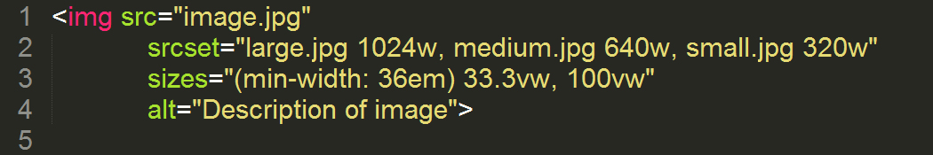
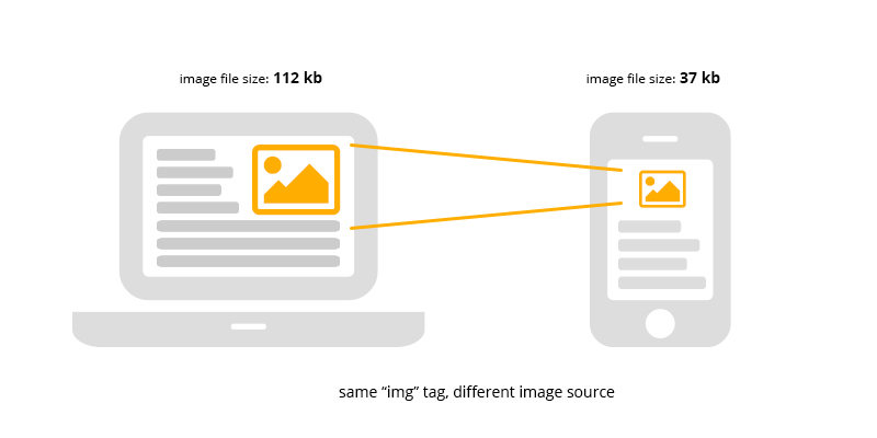
Recently, there has been a lot of talk in the web design community about the usage of the “srcset” and “sizes” attributes of an image. In short, srcset allows the browser to determine which image (out of a set) is the best to use in a given situation. These “situations” that it compares are that of the viewable image size, and the pixel density of one’s browser. This is true for both computers of varying types, as well as mobile devices (particularly important where download speeds are often slower). It take this information, then decides which of the available images in its set best fits that space. Doing this allows for the images on a site to dynamically choose the smallest available image for a certain size, ignoring the larger sizes which would be larger and cause slower load times.

The use of srcset is an important development for the web development community as we pursue improved user experiences and search engine performance. For more information about srcset, the code behind it, and how we implement it, check out: http://responsiveimages.org/. advantage of srcset in the years to come, which will only benefit the web even more!