Month: March 2014
The Importance of being earnest (in keeping your online presence current!)
March 25, 2014Poet and playwright Oscar Wilde may have had some fun with Victorian social conventions in “The Importance of Being Earnest,” but he likely never could have imagined the importance of being earnest about your online presence. Indeed, your online existence says everything many of your potential customers will ever know about your business or organization. That’s why it’s critical to keep both your website and your social media pages up-to-date, in both messaging and design. An appealing look and feel combined with interesting or compelling content will communicate professionalism, capability and relevancy to those searching for a business or organization like yours.
“Themes” replacing “Keywords” as king of Search Engine Optimization
March 19, 2014As any good search engine optimization specialist knows, there are no constants when it comes to achieving good rankings in search engine results pages (SERPs). Staying abreast of industry trends and adjusting to the ever-evolving algorithms used by Google and others is a core part of the SEO services provided by Sharp Innovations.
Themes, Topics and Concepts
One of the latest SEO trends is the migration away from “keywords” or phrases to more robust topics or themes. The traditional focus on single keywords has evolved into thinking about a more holistic message, with Google (in particular) rewarding a page with a consistent theme over a page that is simply loaded with repetitions of a single keyword.
“…we need to be focusing on what the user is looking for rather than specifically all of the ways they can phrase it.” Kate Morris – The Moz Blog
As Google continues to adjust their search algorithm, they’ve recently implemented a new query model which focuses on context versus specific words alone. This, in turn, rewards a page that is optimized with broader themes and topics in mind. This model is more focused on determining what the user is actually looking for, versus simply matching exact keyword phrases that may or may not be relevant. Which, of course, is in keeping with Google’s mission of providing the best search experience possible. With this in mind, a themed page would need to consider both the explicit and implicit facets of a search, or what the user may be searching for coupled with where they are and with what device they are searching from. For example:
Lancaster Antique shops (explicit)
+
Smartphone user, on street in Lancaster (implicit)
When optimizing a page, both the explicit and implicit search queries must be factored into the page theme or topic. In other words, the context in which a user is searching is often just as important as the topic for which they are searching.
Hummingbird
We mentioned earlier that Google frequently changes its search algorithm (by some estimates, a dozen or more times per year). Indeed, Google recently rolled out an update called “Hummingbird,” which, adjusted its way of determining relevancy in a search. This adds support to the idea that themed pages focusing on topics and concepts may be viewed more favorably by engines than specific keyword targets. To read more about Google Hummingbird, check out our previous post on this update.
More fluid content and better optimization
It will come as a relief to both website content editors and their clients to know that they are no longer required to awkwardly jam web pages with keywords in order to climb the SERP ranks. Taking into account the context with which a user is searching, web content authors can develop topics and themes that are attentive to the user’s context and reason for searching. This should result in cleaner content and better rankings!
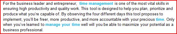
For example, in the content shown below, the phrase “time management” does not need to be stuffed into the page several times for proper optimization, as was attempted in the past. In fact, the preferred method is to write about the topic more naturally, which creates several words and phrases associated with the “time management” theme:
Sharp Innovations offers a complete suite of SEO services, from on and off-page organic optimization to comprehensive social media and blogging packages, and much more. Feel free to reach out and learn how we can help you navigate the ever-changing search engine waters.
Responsive Web Design Vs. Mobile Web Design
March 7, 2014According to the Pew Internet and American Life Project, 91% of all American adults have a cell phone, and 58% have a smartphone. If you’re wondering whether or not now is the right time to be thinking about a mobile-friendly version of your website, the answer for most businesses is that you shouldn’t just be thinking about it, you should already have one. The real question for most businesses is what type of mobile site is appropriate? There are basically two types.
What is Responsive Web Design?
A “responsive” website is one that seeks to provide easy reading and navigation while minimizing resizing, scrolling and left/right panning motions. It does this by dynamically moving and re-sizing parts of your website to allow for proper display and ease of use, regardless of device. Depending on your device’s size, the website may scale and shift pieces in different ways. It does this by using proportion-based grids, resizable images and various media queries. Since the only things that change are behind-the-scenes pieces of code, you don’t need a different domain name for the mobile version (such as “m.examplesite.com” or “mobi.examplesite.com”). Small, medium or large—it’s the same website for every size screen.
The responsive design example below shows you three different ways our Sharp Innovations website displays, depending on whether you are on a desktop (A), a tablet (B), or phone (C).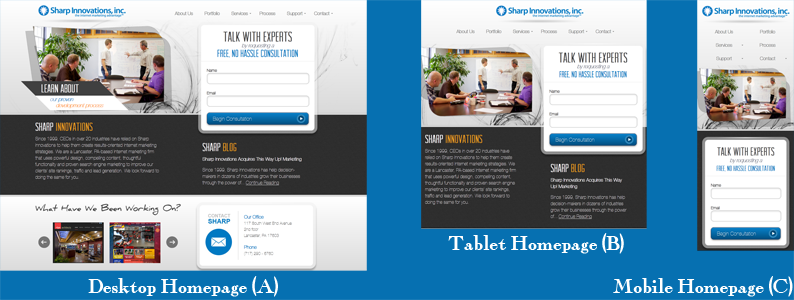
What about Mobile Web Design?
A mobile website is a version of your website specifically optimized for mobile devices, which often includes a unique look built for a specific size. The emphasis here is on removing unnecessary distractions and focusing only on the things that a mobile user is likely to care about most. The problem with a mobile-specific design is that it will be built to a specific screen size or resolution, which has become problematic as new devices continue to be introduced with differences in screen sizes, pixel count, format, etc. In addition, a mobile site must typically reside at an “m.” or “mobi.” address, which creates a second site for search engines to index. If not done properly, this can lead to duplicate content issues.
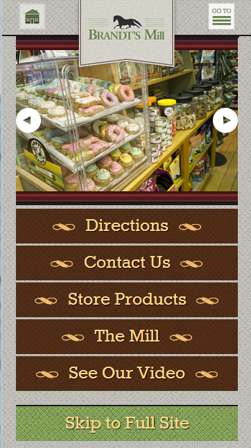
On the plus side, a mobile site can be built to address very specific needs and user interaction preferences for mobile users in completely custom ways, which can reduce costs. Brandt’s Mill, a Sharp Innovations client, had us build a mobile-friendly site for them, as shown below.
Which should we choose for our website?
Both responsive and mobile website design fulfill the role of providing a more user-friendly experience for mobile and tablet visitors. Your specific need will likely determine which route you choose.
A responsive website is Google’s preferred option, so if you’re concerned with obtaining the best possible rankings, this is probably your best bet. In addition, you won’t need to make updates to both the mobile and desktop versions of your website separately, as any change you make on a responsive site is universal and will show-up on all devices. As mentioned before, you also won’t need to setup a separate domain for mobile traffic, so there’s no need for an m.examplessite.com, or similar.
However, if your website is already built and is non-responsive, you may choose a dedicated mobile site to save the effort of a full site redesign and associated costs. Since a dedicated mobile website is specifically built for mobile devices, it may also reduce load times by using smaller images and less content.
In general, if you are having a new website built, we recommend going the responsive route. That’s why we do this for every new website we build as a standard feature. If, however, you have an older website, or you have very specific desires for your website that may be distinct from your core website, a dedicated mobile option may make sense. If any of this is confusing, we encourage you to connect with someone on our team to discuss what would make sense for your specific needs. We’re happy to answer any question about mobile-friendly web design you may have!